
How to Read the Network Diagram
The Network Diagram draws the schedule as a logic network rather than a bar chart: one box per activity, arrows for relationships, laid out left to right by dependency. It is the view for answering what drives what, which a Gantt chart sorted by date cannot show. Pick it from the view button on the Views tab.
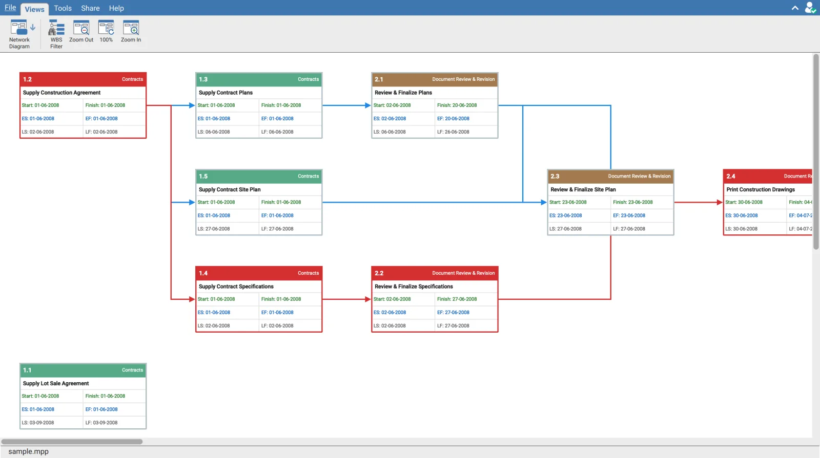
What a box shows
| Part | Content |
|---|---|
| Header, left | Activity ID |
| Header, right | The WBS element the activity belongs to |
| Second row | Activity Name |
| Third row | Start and Finish |
| Fourth row | ES and EF, the early dates |
| Fifth row | LS and LF, the late dates |
The three date rows are colour coded so they can be told apart at a glance: Start and Finish in green, the early dates in blue, the late dates in grey. Dates are drawn in the format set under Tools then Settings.
Having ES, EF, LS and LF on the face of every box is the point of this view. Total float is the gap between the early and the late pair. A box whose early and late dates are identical has none, which is the definition of the critical path, and you can read that off the box without adding a single column.
Colour
| Colour | Meaning |
|---|---|
| Red header and red border | The activity is critical |
| Any other header colour | The colour of the WBS element it belongs to |
| Red arrow | A relationship on the critical path |
| Blue arrow | Any other relationship |
So the critical path reads as a continuous red run of boxes and arrows through the network, and everything else is grouped by colour into its part of the breakdown structure.
Selecting an activity traces its logic
Click a box. It is tinted and outlined, and so are its direct predecessors and successors, with the arrows between them drawn heavier.
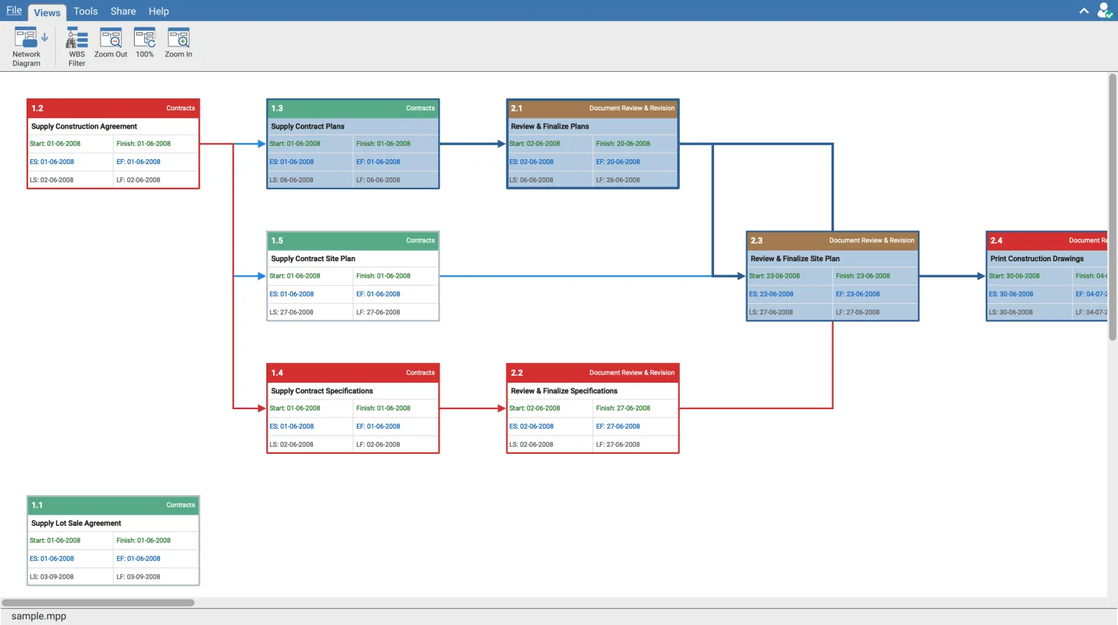
The highlight is one hop, deliberately. It shows what feeds the activity and what it feeds, not the whole chain. Follow a path by clicking the next box along, which re-centres the highlight on that activity. Lighting up everything downstream would colour most of the diagram on any real schedule and tell you nothing.
Zoom
| Button | Effect |
|---|---|
| Zoom Out | Steps down, as far as 20% |
| The middle button | Returns to 100% |
| Zoom In | Steps up, as far as 300% |
The middle button is also the readout. Its label is the current zoom, not a fixed 100%: at 30% it reads 30%. That is the only place the zoom level is shown, and clicking it is what snaps back to full size.
Two things change as you zoom out
Below 91% the box text is too small to read, so hovering a box raises a floating panel with its Activity ID, its name, the WBS element, and a Critical badge when it is on the critical path. The panel follows the pointer and stays inside the window.
Below 35% the boxes stop drawing their contents altogether and become solid blocks in their colour.
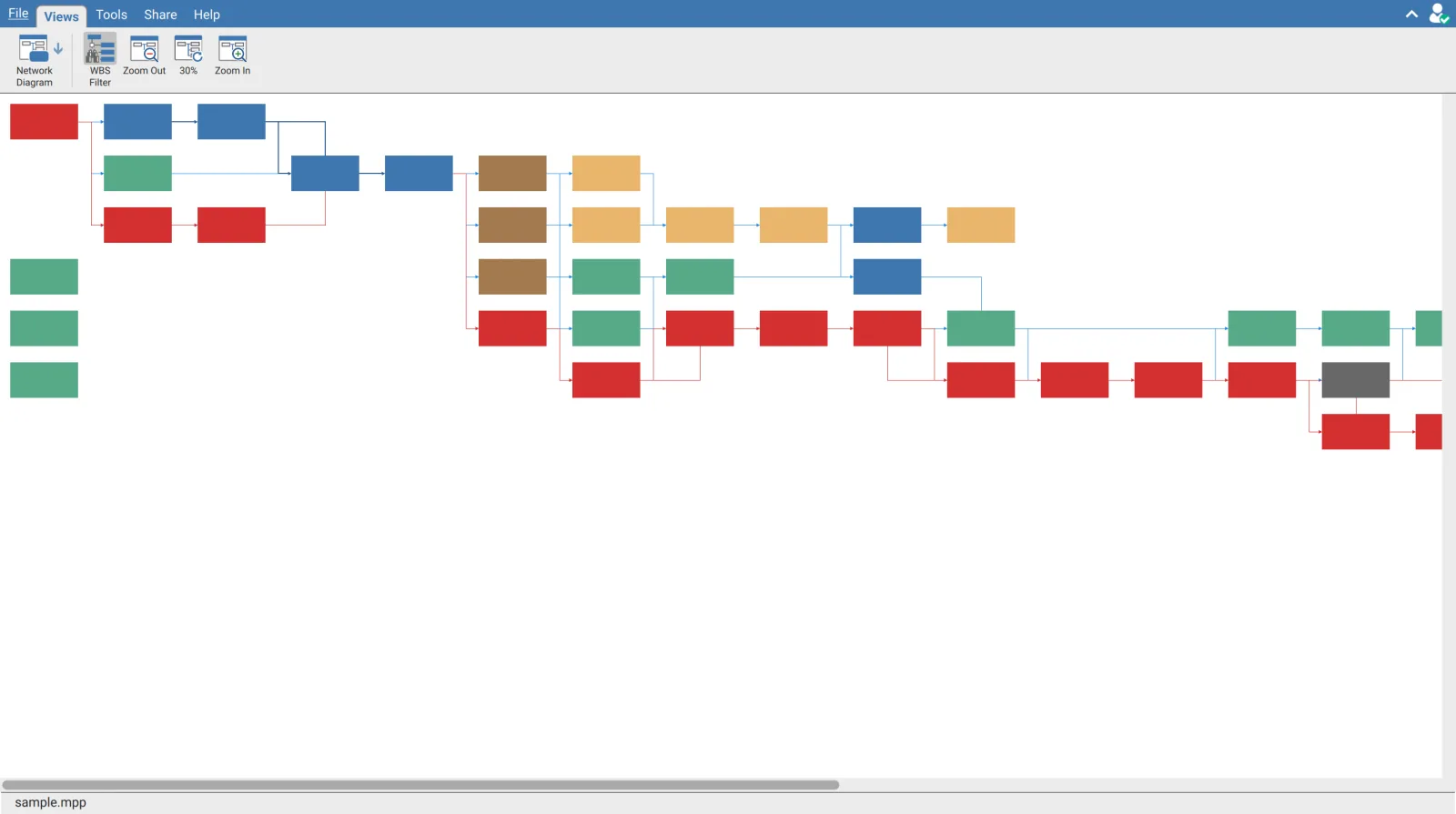
Zoom out first, then work in. The shape of the network, where it fans out, where it necks down to a single chain, and how the red run travels through it, is visible at 30% and invisible at 100%. Hover any block that looks interesting to find out what it is without zooming back in.
Filtering to one part of the breakdown structure
WBS Filter slides a panel in on the left. Select a WBS element and the diagram redraws with only the activities under it.
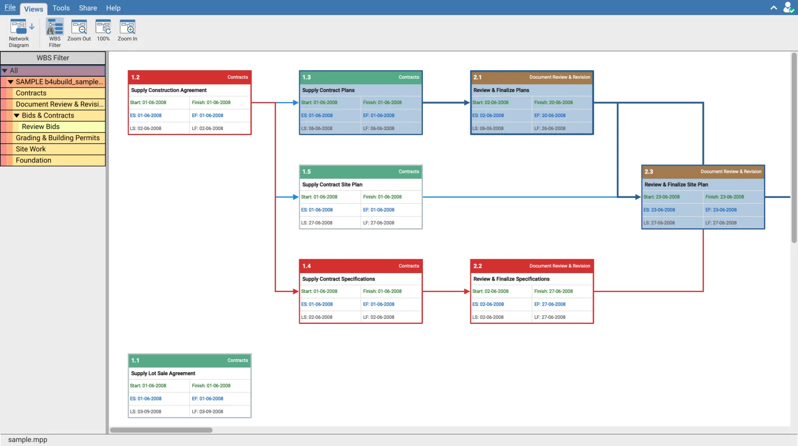
The colours in the panel are the colours of the box headers, so the panel doubles as the legend for the diagram. All at the top returns the full network.
The button reports two different things. Its icon changes once a filter is applied, and it stays highlighted while either the panel is open or a filter is in force. So a highlighted button with no panel on screen means a filter is still applied. If the network looks short of activities, that is the first thing to check.
The panel is on a split handle, so its width drags, and clicking WBS Filter again slides it away without clearing the filter.
Building the layout
Positions are computed rather than stored, so opening the view on a large schedule shows Building Layout ... while that runs. Activities are placed in columns by dependency depth and then aligned against their predecessors, so an activity always sits to the right of everything that drives it.
The diagram scrolls in both directions with scroll bars on the edges of the pane. Where a schedule has no activities to draw, the view says No Activity found rather than showing an empty canvas.
Requirements
Requires an open schedule and a signed in account.