
How to Configure Gantt Bar Styles, Progress Fills, and Activity Labels
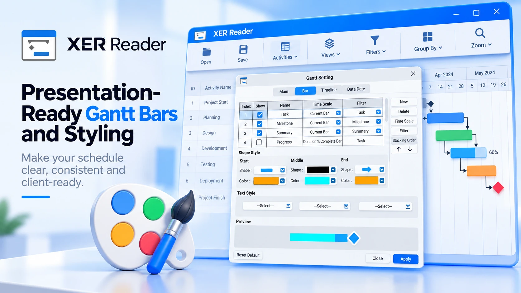
Gantt chart bars provide the primary visual representation of project schedules in XER Reader. Through the dedicated Bar settings interface, project teams can customize bar colors, geometry endpoints, progress completion fills, and activity text labels to produce clear, executive-ready presentations.
Accessing the Bar Settings Interface
XER Reader centralizes all timeline styling within the Gantt Setting dialog. To open the interface:
- In the top toolbar ribbon, click the Views tab and select Gantt Setting (or open Tools → Gantt Setting).
- In the Gantt Setting window, select the Bar tab located between the Main and Timeline tabs.

Managing Bar Styles and Stacking Order
The top table on the Bar tab lists all defined bar representations. Each row defines how a specific category of schedule activity renders on the timeline:
| Column / Control | Function | Description |
|---|---|---|
| Index | Layer Priority | Identifies the row sequence and evaluation order of the bar style. |
| Show | Visibility Toggle | Check or uncheck the box to display or hide that bar style on the timeline. |
| Name | Style Identifier | Editable name for the bar (e.g., Task, Milestone, Summary, Progress). |
| Time Scale | Date Binding | Selects which schedule dates define bar span: Current Bar, Duration % Complete Bar, Physical % Complete Bar, Actual Bar, Early Bar, Late Bar, or Remain Bar. |
| Filter | Activity Scope | Restricts the bar to specific activity classifications: Task, Milestone, Summary, Normal, Completed, In Progress, Not Started, Level of Effort, or All Activities. |
| Stacking Order | Visual Layering | Use the Up and Down arrow buttons on the right panel to shift layers. Bars higher in the list render in front of lower bars. |
Customizing Bar Geometry, Endpoints, and Progress Fills
Selecting any row in the table activates its styling parameters in the Shape Style section below:
- Start, Middle, and End Shapes: Choose the bar body thickness (full height bar, half-height bar, or thin line) and boundary shapes (flat endpoints, left or right triangles, or diamond milestone markers).
- Color Selectors: Click the color swatch below each section to pick fill colors. By default, standard tasks use a cyan body with orange end caps, while milestones use gold diamonds.
- Progress Completion Fills: To visualize schedule execution, enable the Progress row in the table (Time Scale: Duration % Complete Bar or Physical % Complete Bar, Filter: Task). The green fill (#00d000) overlays inside active task bars up to the recorded percent complete, offering instant visual status without cluttering table columns.
Configuring Activity Labels and Data Fields
The Text Style section allows schedule attributes to be displayed directly alongside Gantt bars:
- Left Position: Displays text to the left of the bar. Ideal for Activity ID or Start Date.
- Middle Position: Displays text centered inside the bar body. Useful for concise metrics such as percent complete or duration.
- Right Position: Displays text immediately following the bar finish. This is the standard position for Activity Name, allowing task descriptions to read clearly across the timeline.
Click the dropdown at any position to bind fields such as Activity Name, Activity ID, Total Float, Start Date, or Finish Date. To remove a label, set its dropdown to None.
Previewing and Applying Changes to the Gantt Chart
The Preview area at the bottom of the dialog renders an interactive preview of the selected bar configuration in real time, reflecting your chosen shapes, colors, and text positions.
Once your styles are configured:
- Click Apply in the bottom right of the dialog to commit changes and refresh the timeline canvas immediately.
- Click Close to dismiss the dialog window.
- If you ever wish to restore initial application settings, click Reset Default in the bottom left corner.
