
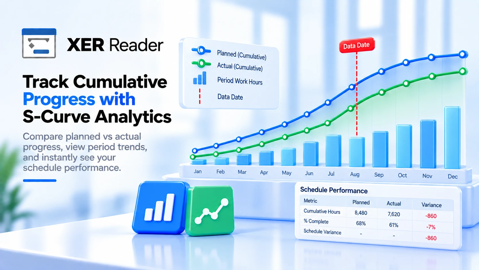
The S-Curve plots cumulative planned progress against cumulative actual progress, both as a percentage of the whole project, month by month. It answers one question: is the work going in at the rate the plan said it would. Pick it from the view button on the Views tab.
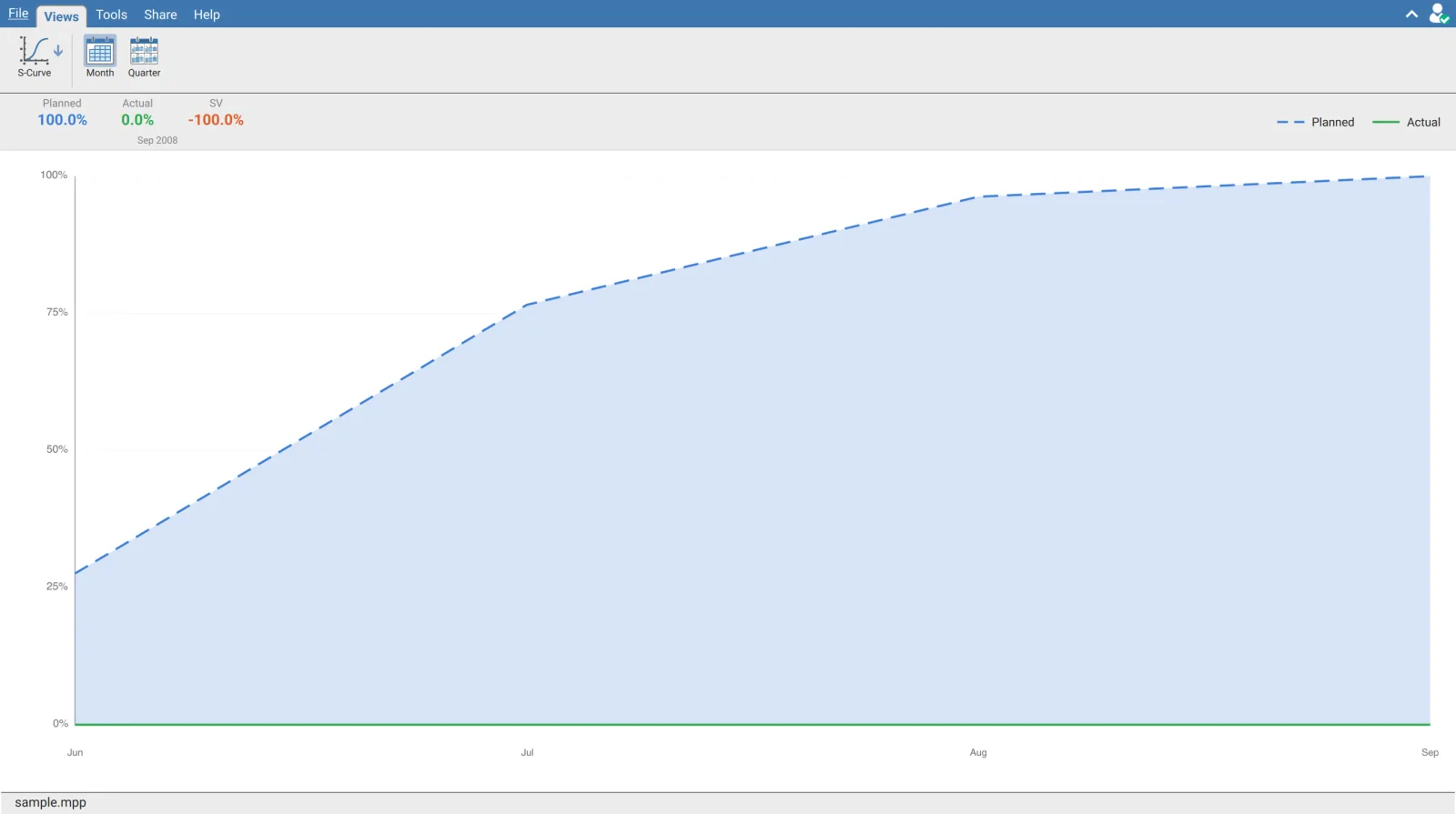
The stats bar
| Figure | Meaning |
|---|---|
| Planned | Cumulative planned progress at the current position, as a percentage |
| Actual | Cumulative actual progress at the same point |
| SV | Schedule variance, Actual minus Planned |
| The date under them | The period those three figures are taken from |
SV is green when actual has reached or passed planned and orange when it has not, so the colour alone says whether the project is behind.
The figures are taken at today's date, not at the data date. The view finds the data point nearest to the real calendar date on your machine and reports that one. Open an archived schedule that finished years ago and it will show Planned 100% with the project's final month underneath, because that is the point nearest today. The curve itself is still correct; only the three headline figures move with the calendar.
Actual and SV disappear when the schedule has no actual dates. Both figures, and the Actual entry in the legend, are shown only when at least one activity carries an actual start. An unstatused schedule shows the planned curve alone.
How the two curves are worked out
Both curves are weighted by planned duration hours, so a long activity moves the curve more than a short one. The total of those hours across the project is the 100% the percentages are measured against.
| Curve | At each month end |
|---|---|
| Planned | An activity contributes all its hours once its planned finish has passed, or a straight line share of them while it is still running |
| Actual | An activity contributes all its hours once it has an actual finish, or its physical percent complete share of them once it has an actual start |
The planned spread is linear, by calendar day. An activity running across a month contributes in proportion to the days elapsed, not to its calendar's working days and not to any resource curve. A schedule with long activities spanning holiday shutdowns will show a planned curve slightly ahead of what the calendars would give.
| Rule | Effect |
|---|---|
| Activities without both a planned start and a planned finish | Left out of the calculation entirely |
| Activities with zero or missing planned hours | Counted as one hour, so milestones still register |
| An activity with an actual finish | Counted as fully complete, whatever its physical percent says |
The actual curve is driven by Physical % Complete. An activity that has started but carries no physical percent contributes nothing until it finishes, at which point it jumps to its full weight. On a schedule statused by duration or units rather than physical percent, the actual curve will understate progress and sit as a staircase rather than a smooth line.
Month and Quarter
Two buttons on the ribbon set the spacing, and the one in force stays highlighted.
| Button | Shows |
|---|---|
| Month | Every monthly point, from the earliest planned start to the latest planned finish |
| Quarter | Only the March, June, September and December points |
Quarter does not recalculate anything. The curve is always computed monthly; Quarter keeps the four quarter end points of each year and hides the rest. The figures at those points are identical in both modes, so switching is purely about how crowded the chart is on a long project.
Reading the chart
| Element | Meaning |
|---|---|
| Dashed blue line | Planned, with a pale blue fill beneath it |
| Solid green line | Actual, with a pale green fill beneath it |
| Horizontal dashed lines | 0%, 25%, 50%, 75% and 100% |
| Vertical dashed lines | Year boundaries, labelled with the year |
| Lower labels | Month names, thinned out when the project is long |
The gap between the two lines is the schedule variance at that point. Green above blue is ahead of plan, green below blue is behind, and the vertical distance between them is how far.
Reading a specific period
Move the pointer across the chart. A vertical line follows the nearest data point and a card appears with that period's name, its Planned and Actual percentages and its SV.
This is the only way to read a period other than the one the stats bar picked. The bar is anchored to today; the hover card is anchored to wherever the pointer is, which is what you need when reporting against a data date in the past.
When the chart is empty
With nothing to plot the view says No data, open a project to view the S-Curve. On an open project the usual cause is that no activity carries both a planned start and a planned finish, since those are what the calculation is built from.
Requirements
Requires an open schedule and a signed in account.